PROJECT
Bom Dia
AREA
Naming / Identity / Packaging
CONCEPT
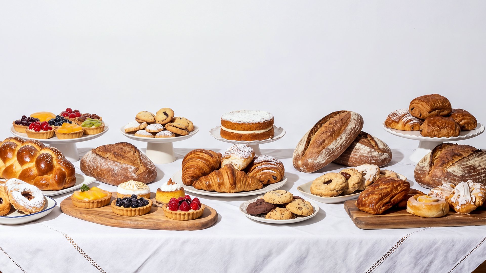
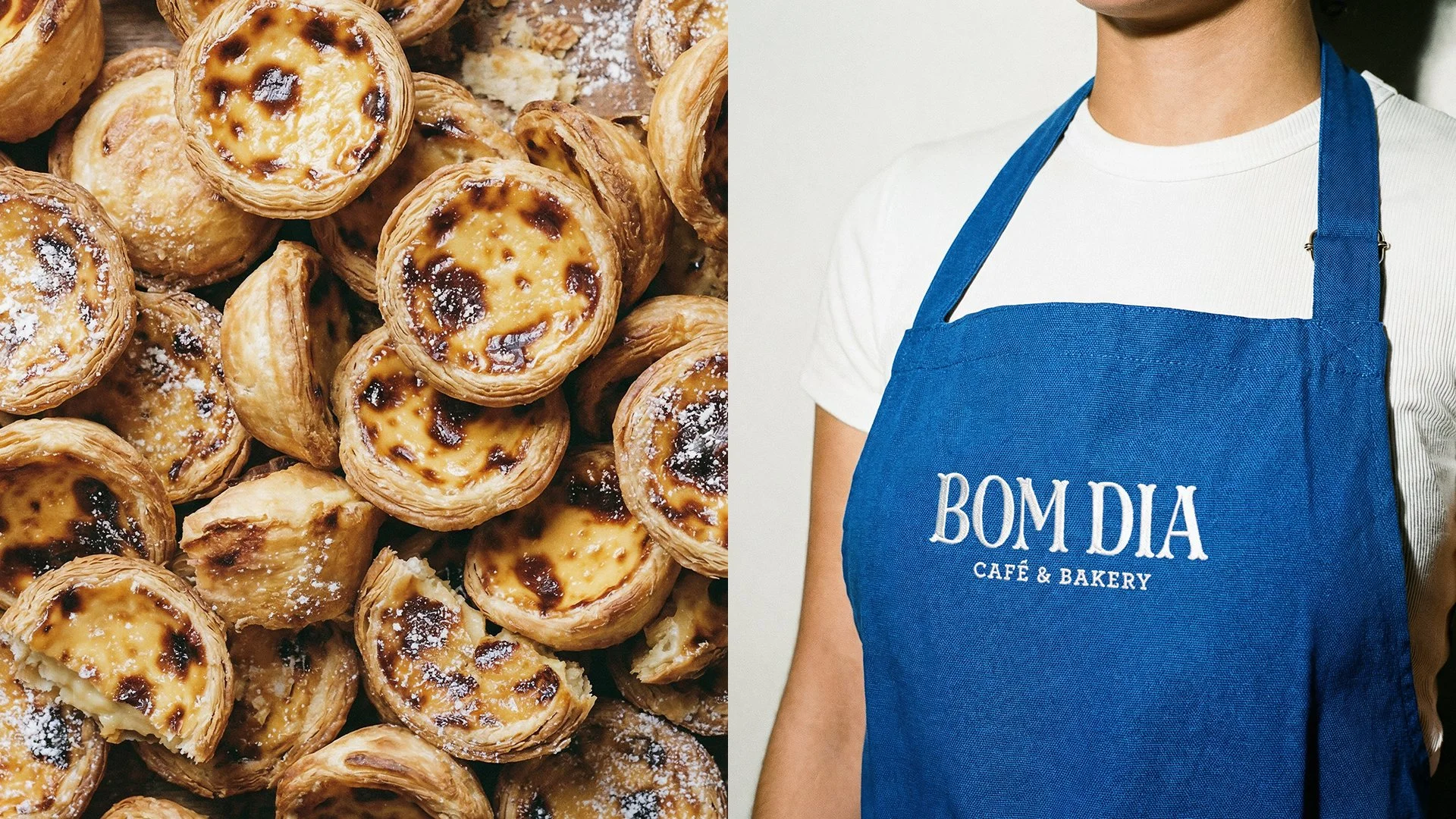
"Bom dia" translates to "Good morning" in Portuguese, a warm and everyday greeting that perfectly sets the welcoming tone for this authentic Cafe & Bakery located in Toronto, Canada. The goal was to create a brand that feels like a true Portuguese embrace, inviting customers to start their day with tradition and flavor.
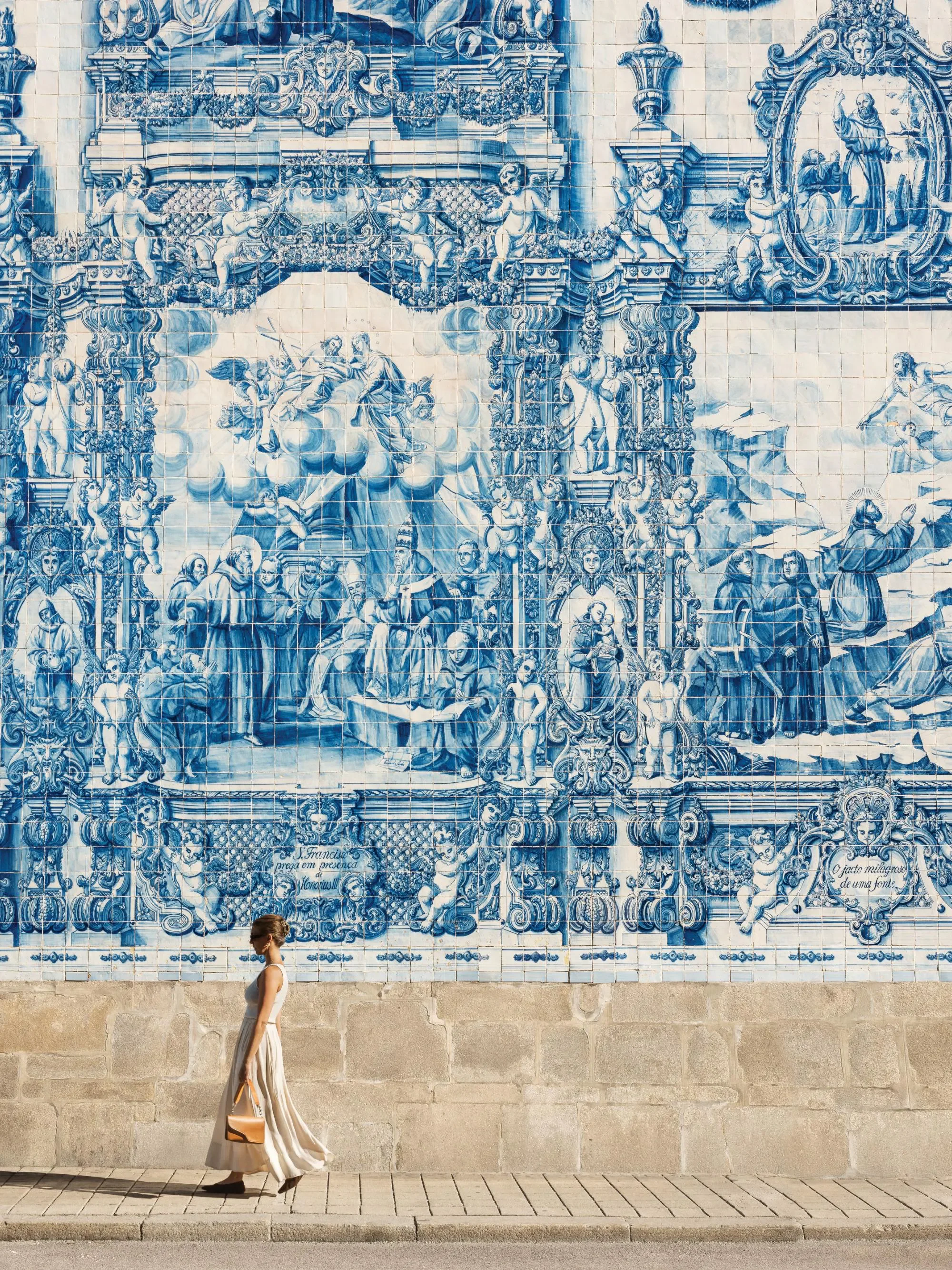
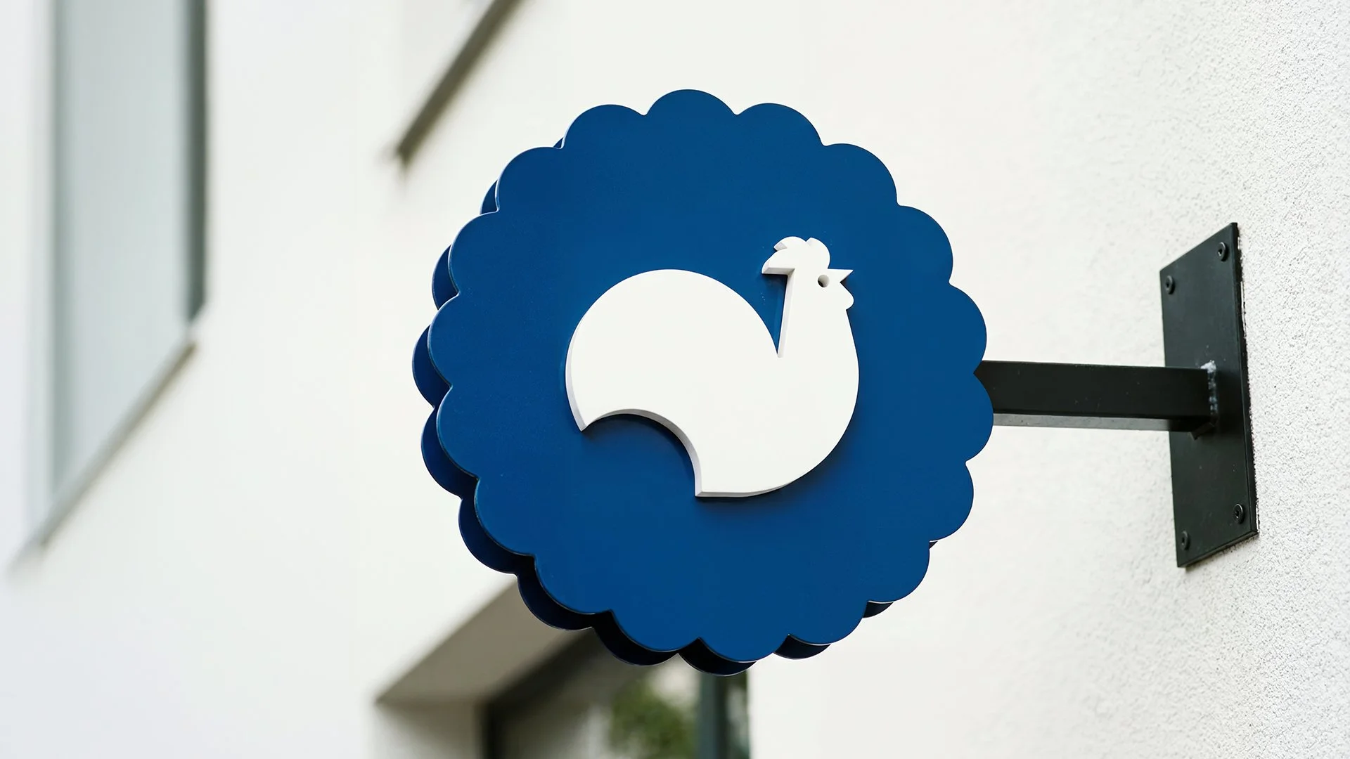
At the heart of the brand's identity is the rooster. Inspired by the iconic "Galo de Barcelos", a landmark symbol of Portuguese culture, the rooster represents the herald of a new day. It is the perfect metaphor for a bakery, waking up the neighborhood with the aroma of fresh coffee and pastries.
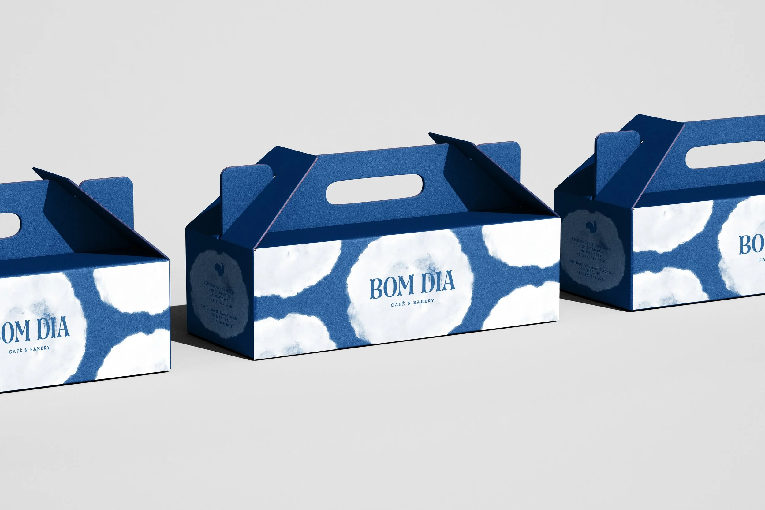
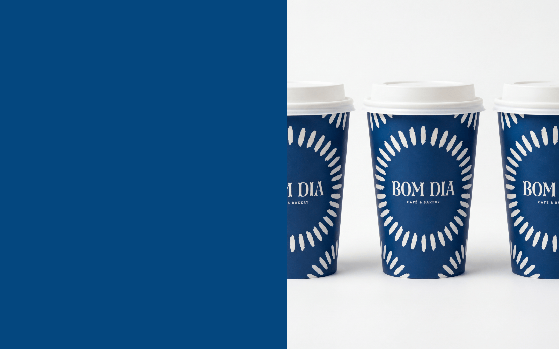
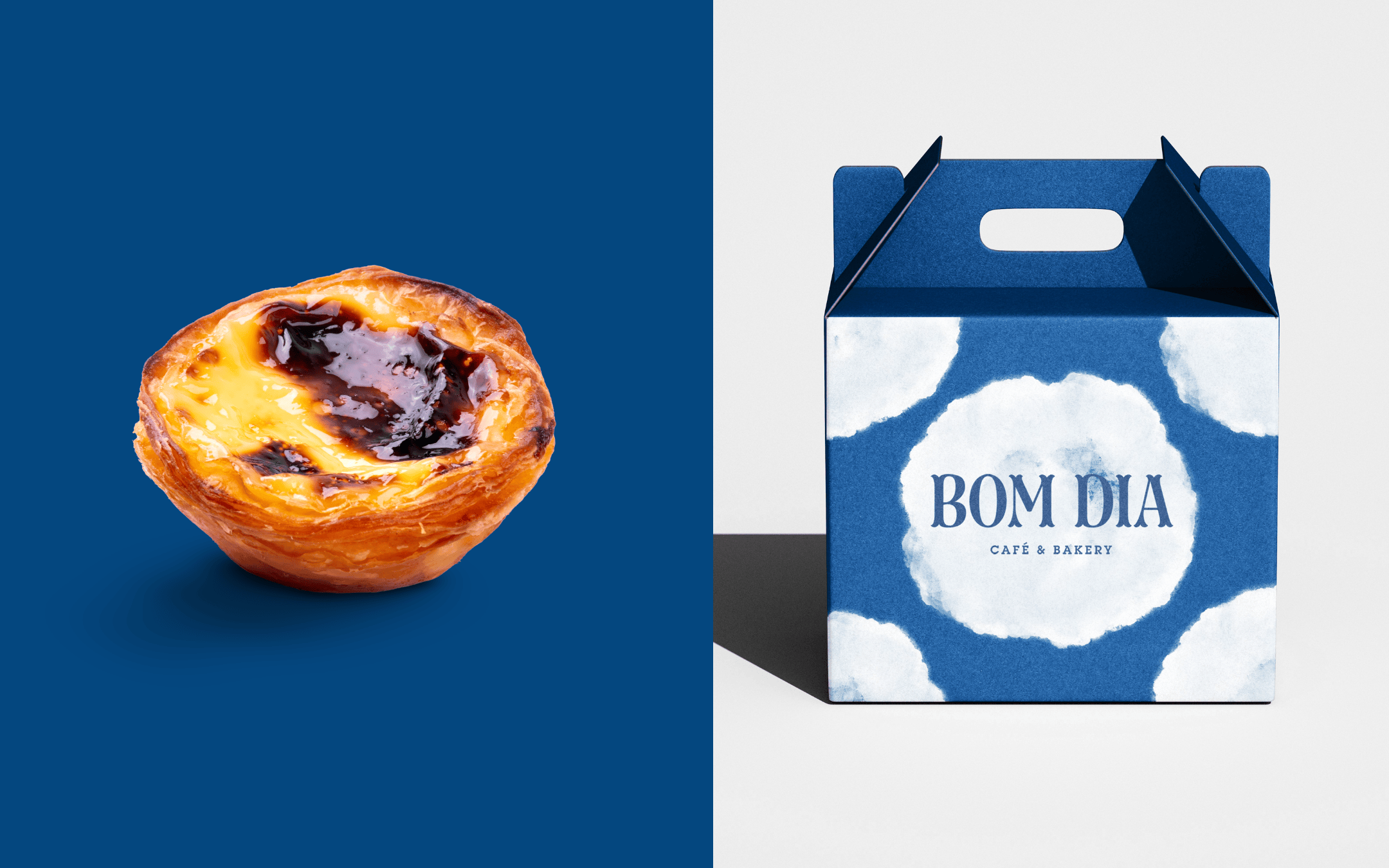
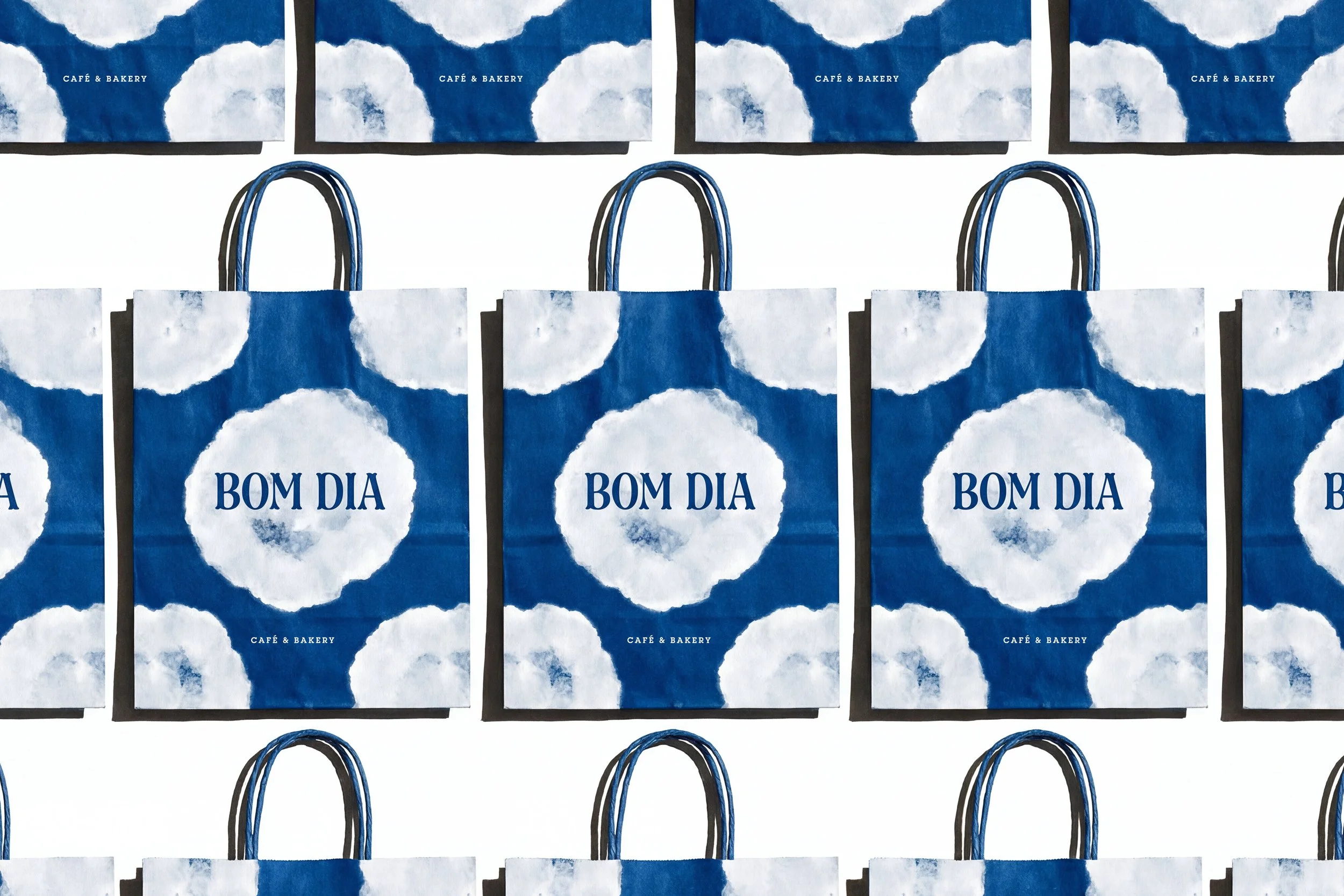
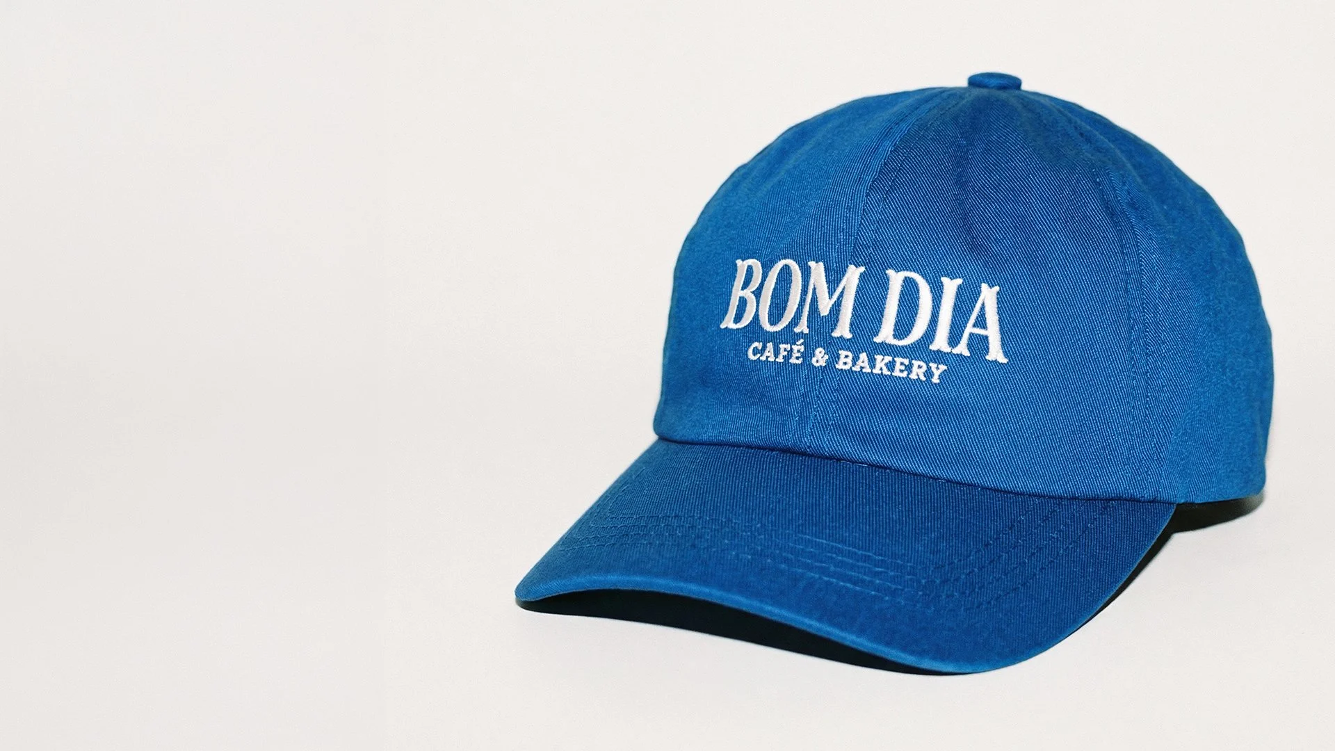
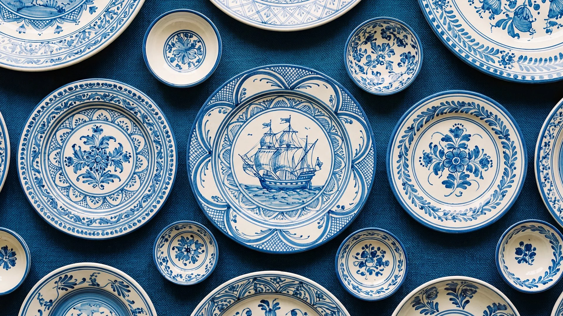
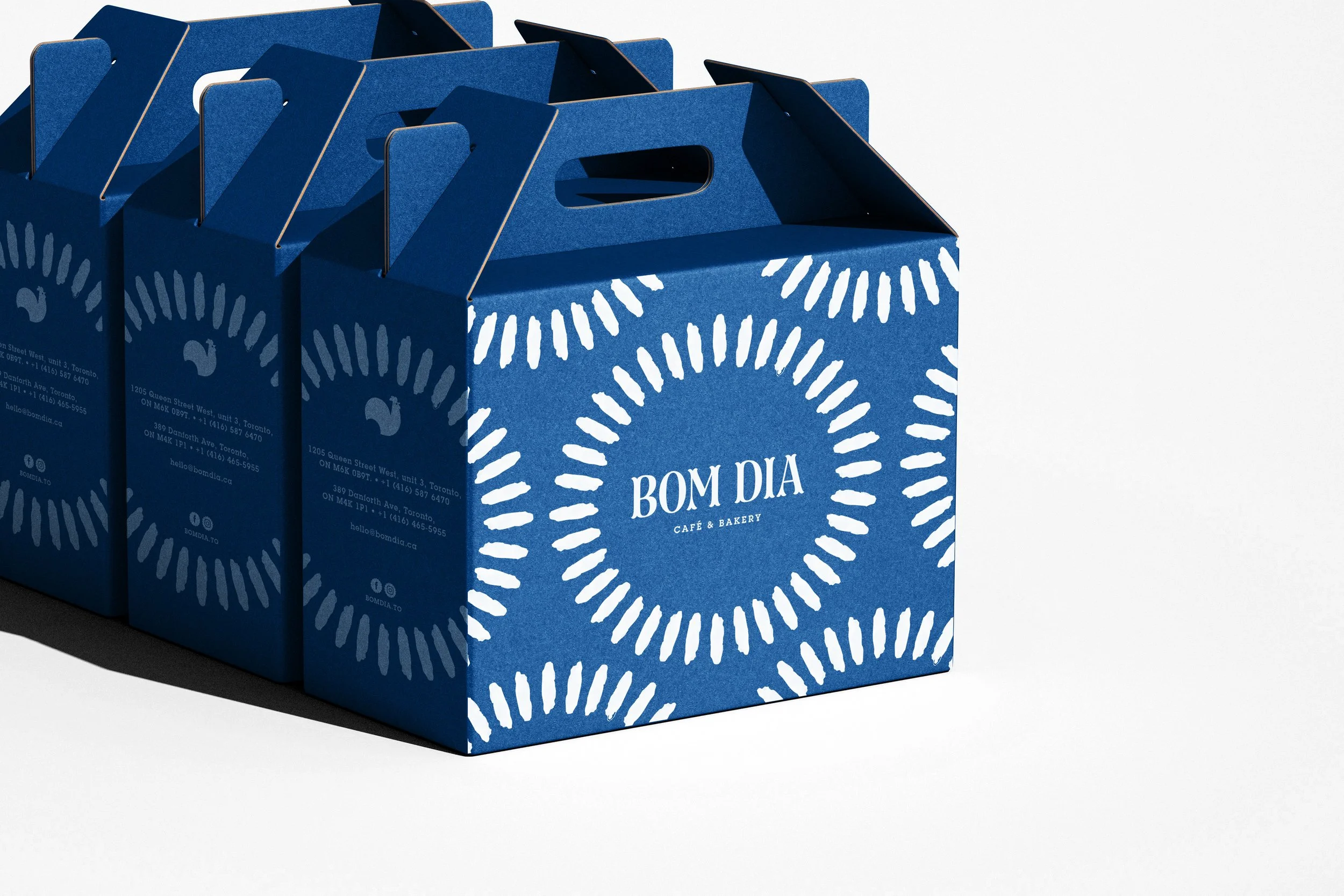
For the brand rollout, the visual system leans heavily into Portugal’s rich graphic heritage. Inspired by traditional hand-painted ceramics and iconic azulejos (Portuguese tiles), we developed a custom "sun" motif as a core graphic asset. This element was designed to be versatile across multiple touchpoints, from packaging to spatial design. The color palette is anchored in a deep, vibrant blue, a hue that is inextricably linked to Portuguese culture and aesthetics.
The result is an authentic, culturally rich brand that invites the Toronto community to experience the true quality of Portuguese baking. The concept resonated so well with the public that, just four years after its grand opening, Bom Dia has successfully expanded to two locations, continuing to share its warm "Good morning" with a growing family of customers.