
PROJECT
Angles90
AREA
Identity/Rebranding/Packaging
CONCEPT
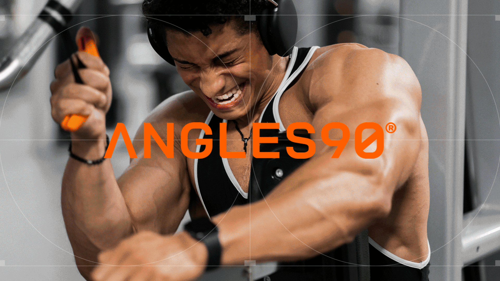
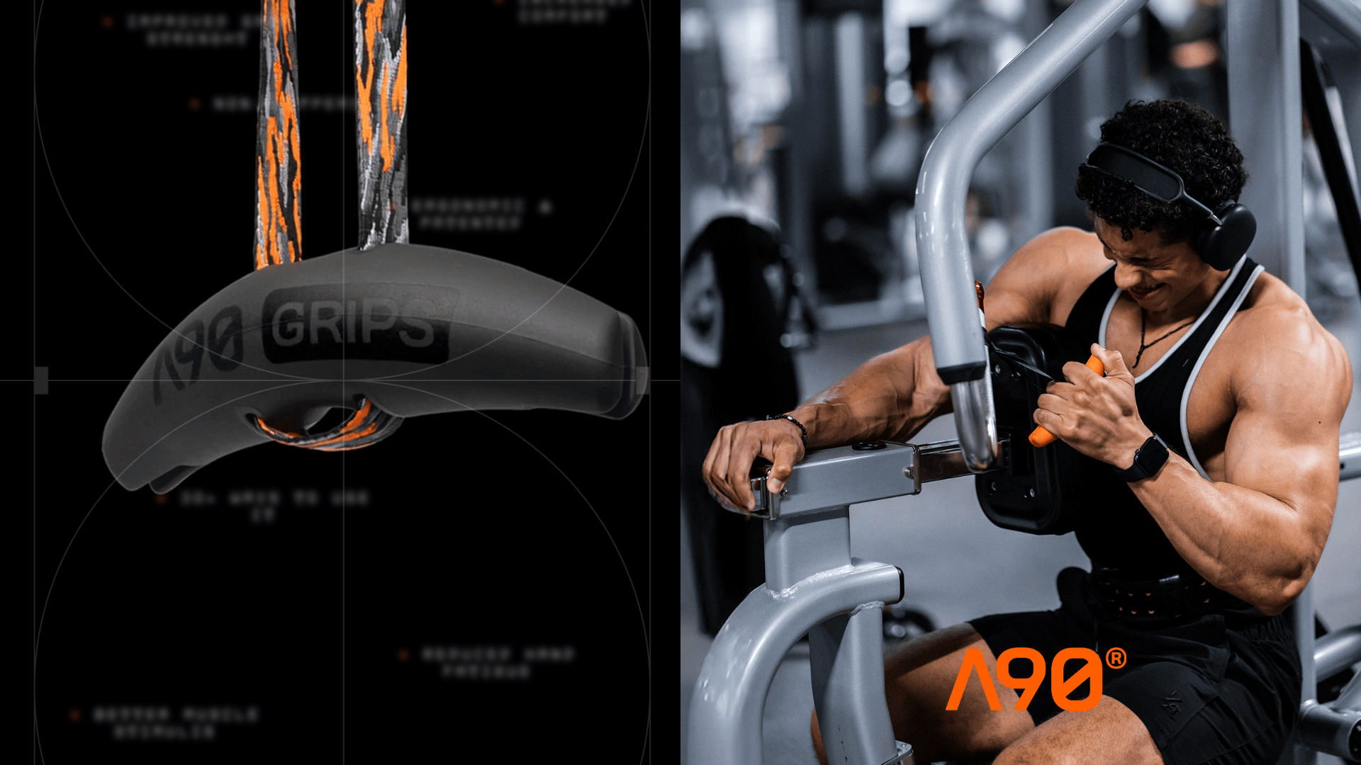
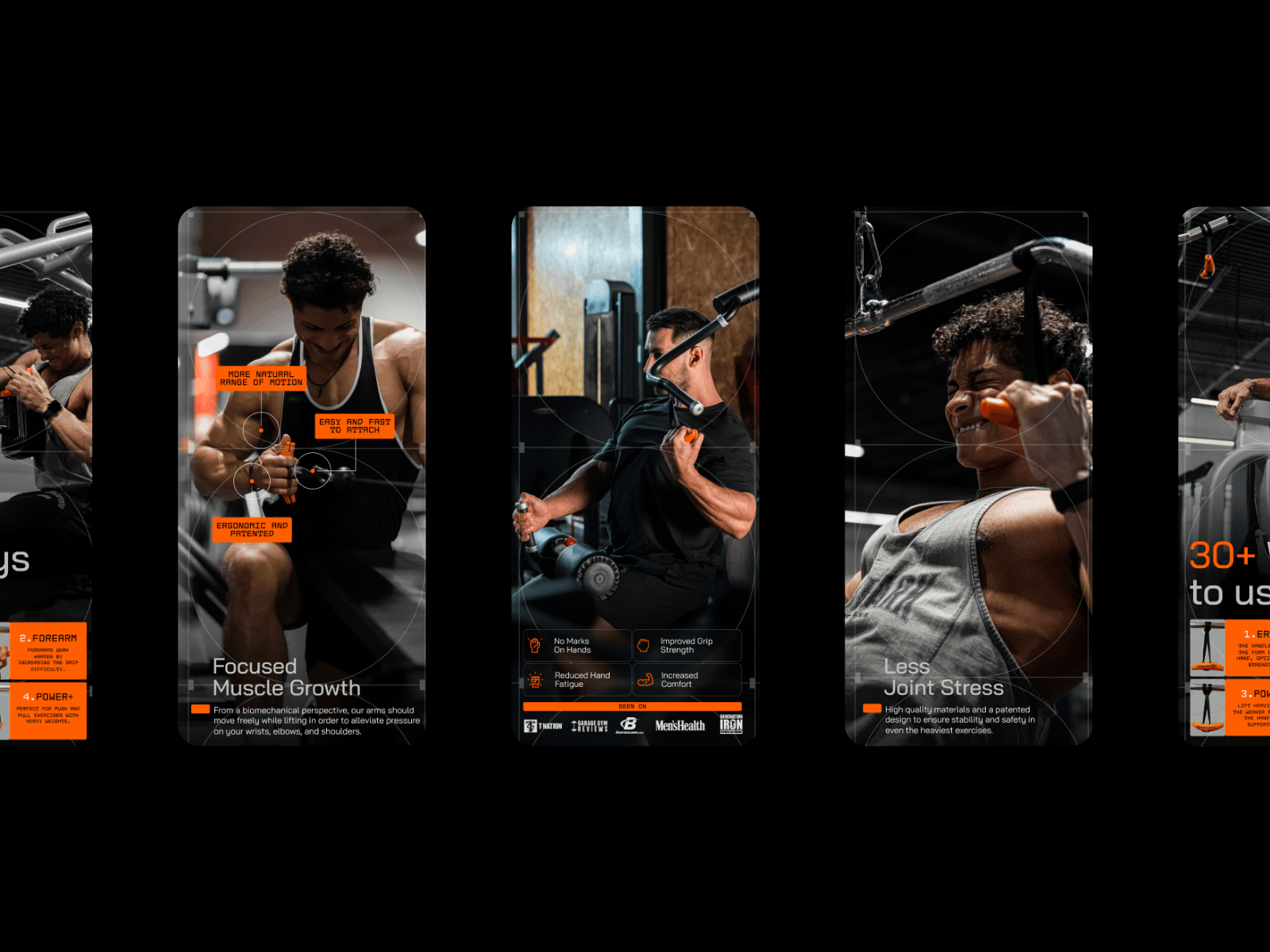
Angles90 is a brand that’s all about innovation and science-based training design. Their hero product, the A90 Grips, has sold over 50,000 pairs worldwide. They are built to move with your body, not against it, helping athletes train more naturally and push their limits.
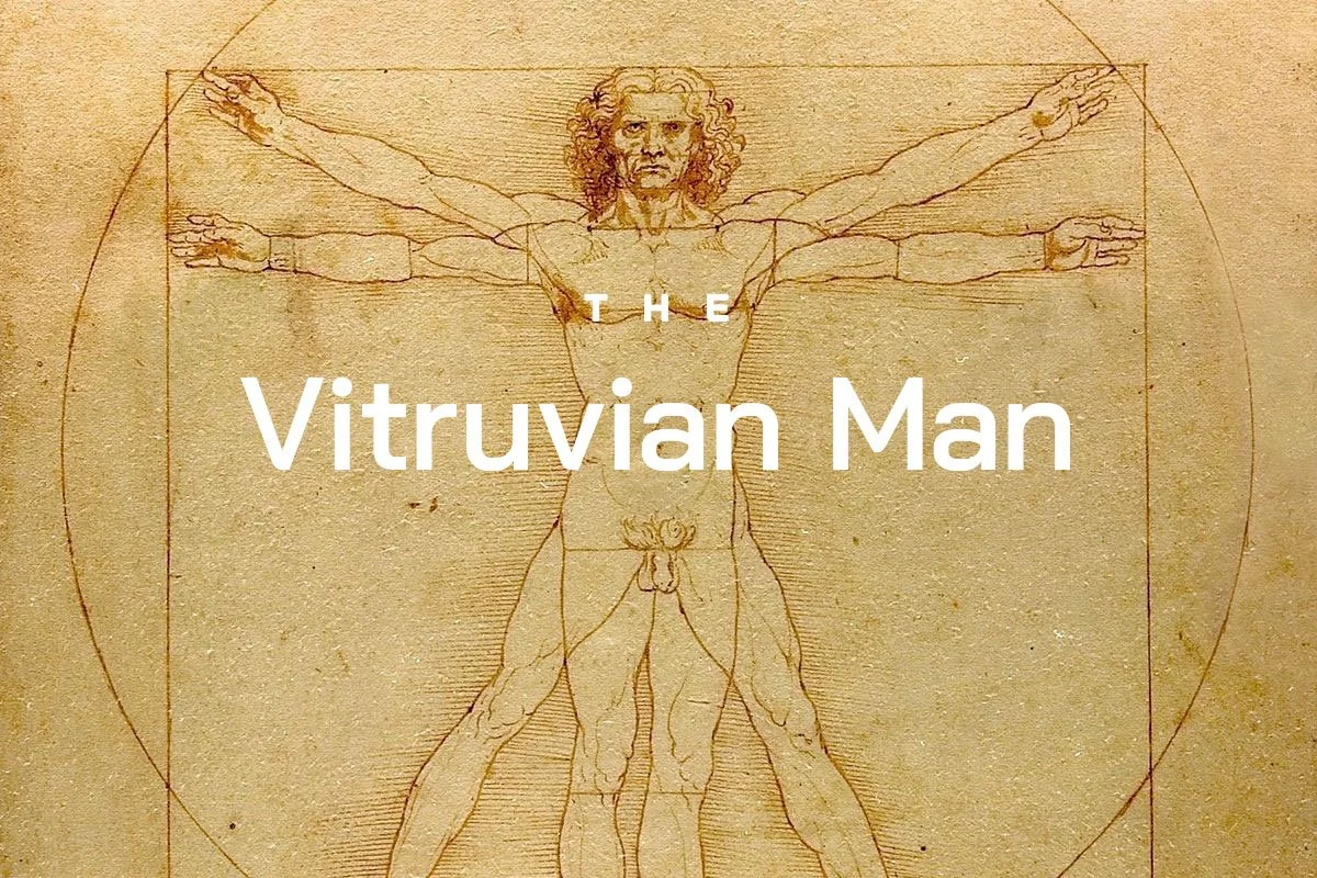
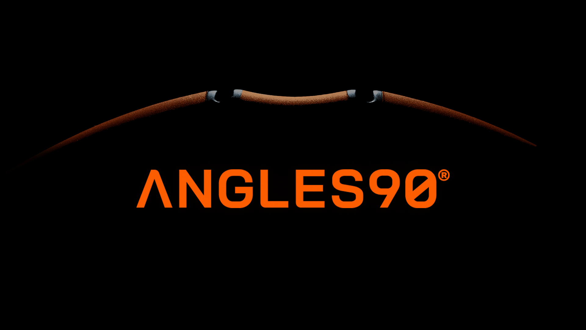
A brand system was created inspired by the Vitruvian Man, a symbol of balance, proportion, and human potential. The goal was to capture that same idea of harmony between performance and ergonomics. The identity reflects this connection between the human body and peak performance.
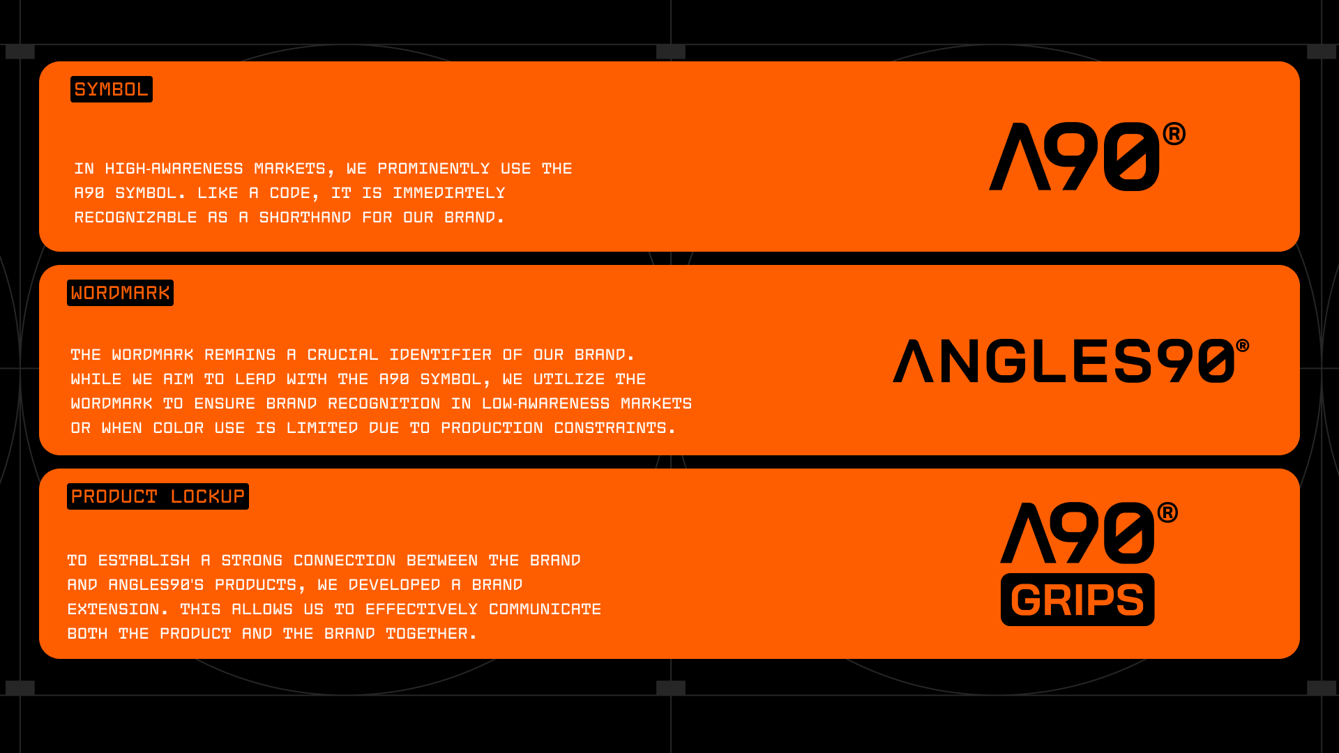
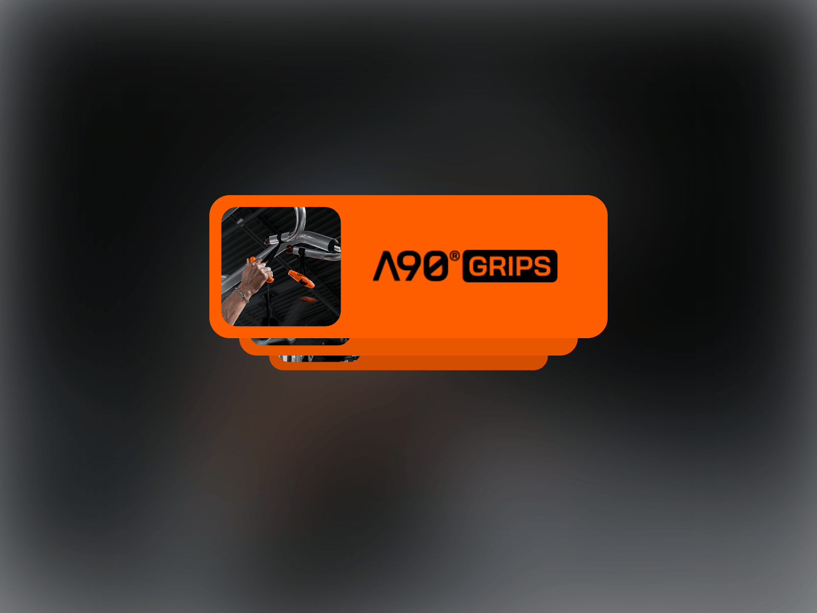
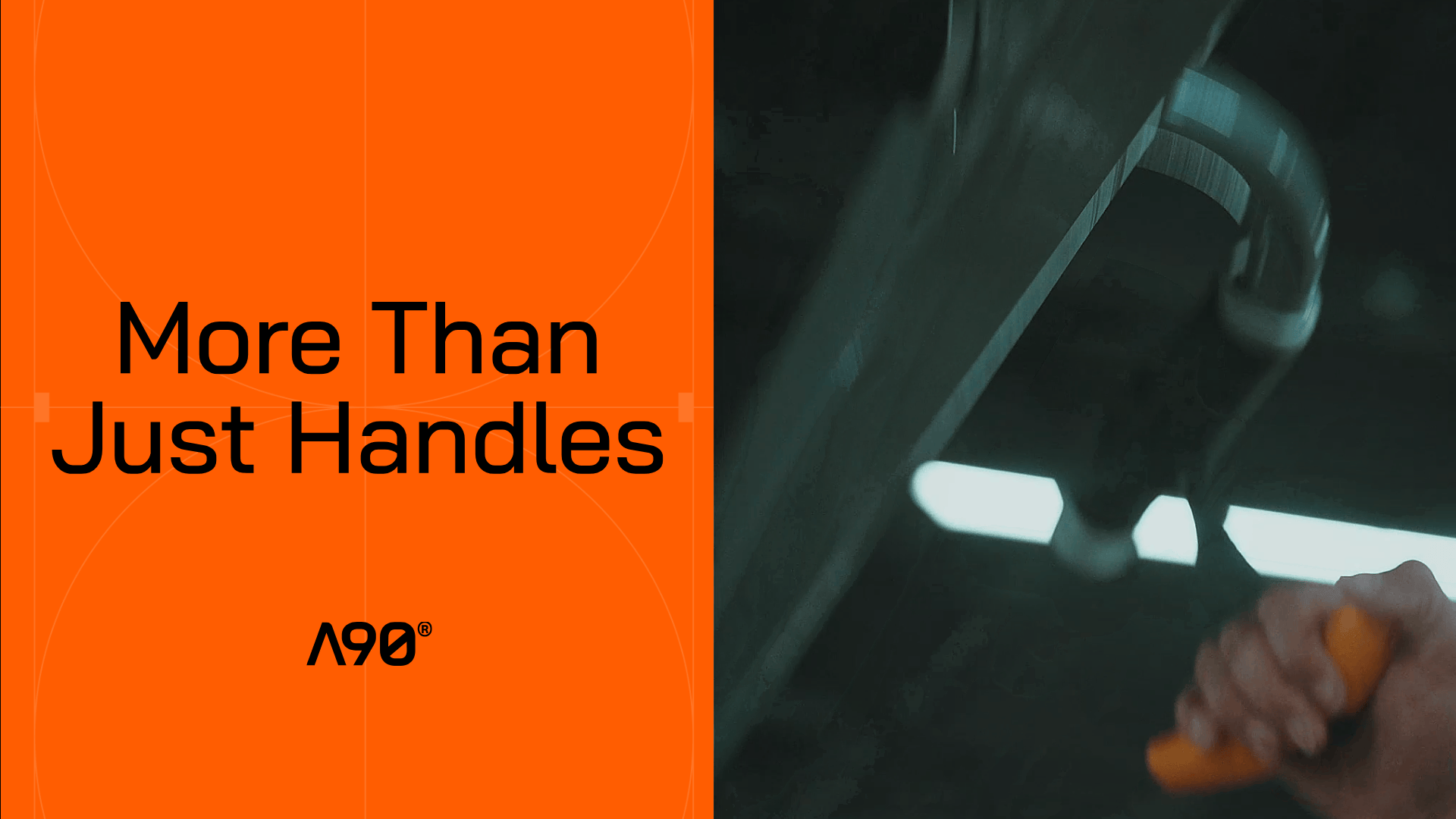
The iconic orange has been a defining element of A90’s identity since the beginning, inspired by the original A90 grips. Even without seeing the logo, the vibrant orange instantly connects the product to the brand. With the rebrand, we decided to preserve this distinctive color while giving it a fresher, more dynamic, punchier tone.
The typography takes cues from the grips themselves, featuring rounded shapes that feel both strong and approachable, echoing the product’s ergonomic design.
The overall visual direction leans into that “gym-bro” energy, with raw effort, intensity, and motivation. But gives it a modern, science-backed twist. It represents the mindset of working hard and training smart.


This project was developed in collaboration with Tobias Carreras Studio.