Case 01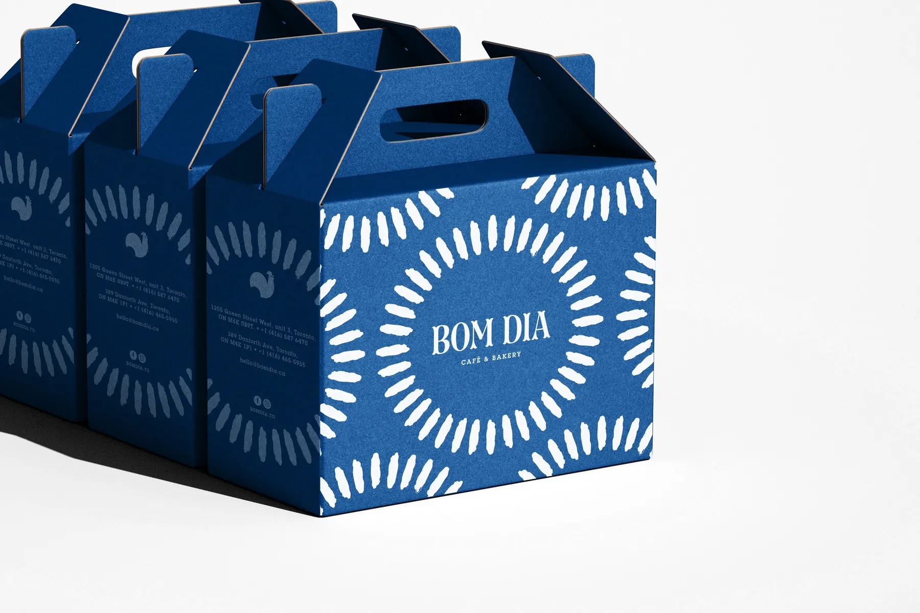
Café & Bakery
Bom Dia Café & Bakery
Bringing the Portuguese “good morning” to Toronto.
- Client
- Bom Dia Café & Bakery
- Sector
- Food & Hospitality
- Scope
- Identity, Packaging, Space
Context
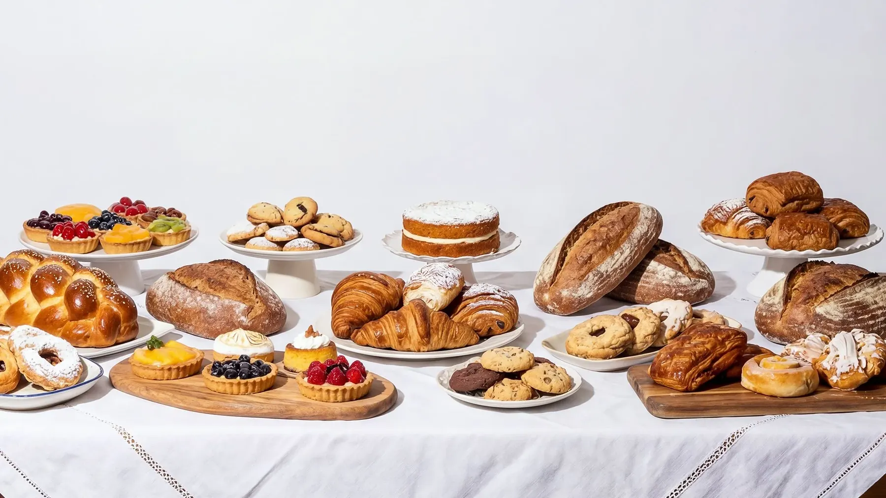
“Bom dia” means “Good morning” in Portuguese, a warm, everyday greeting that inspired the welcoming identity of this authentic café and bakery in Toronto. At the heart of the brand is the rooster, inspired by the iconic Galo de Barcelos, a herald of a new day.
Approach
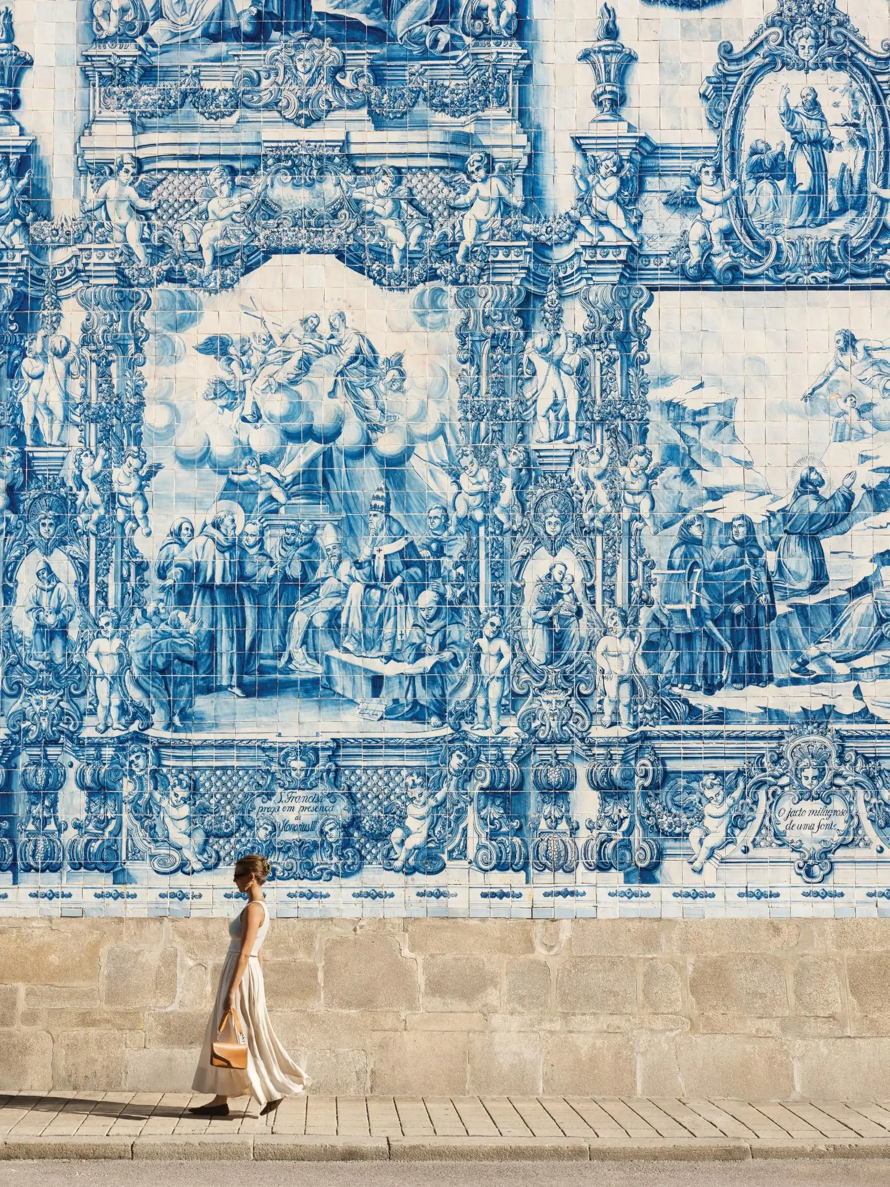
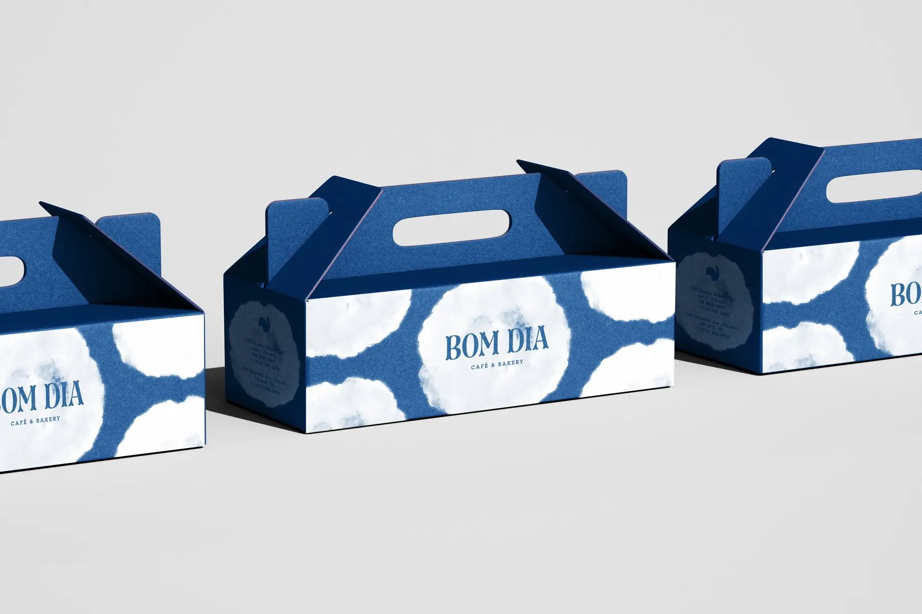
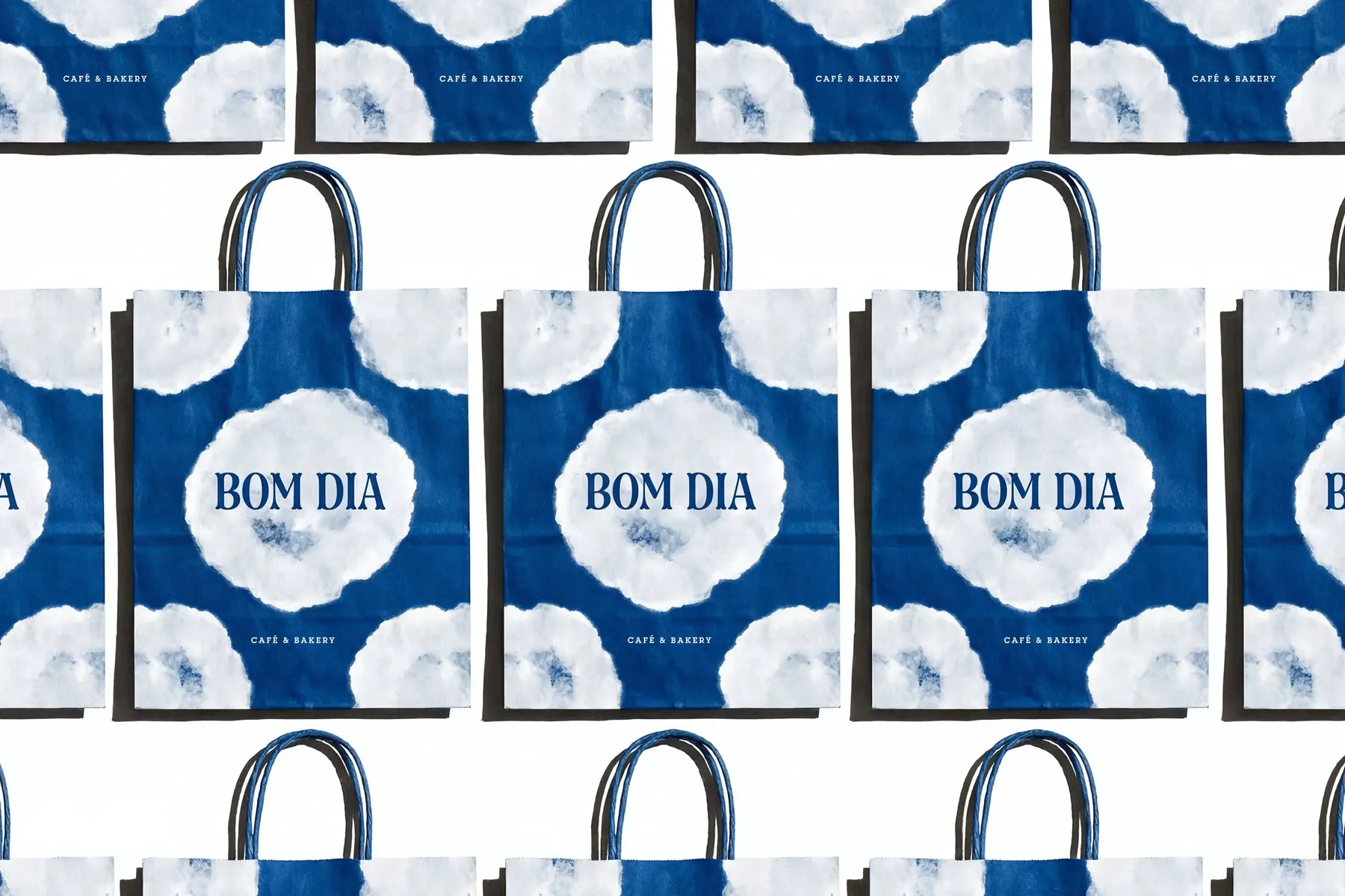
The visual system draws from Portugal’s graphic heritage, ceramics and azulejos. A custom sun motif and a deep, vibrant blue create a flexible identity across packaging and space. Four years after opening, Bom Dia expanded to two locations.
Two locations four years after opening.
Next projectCryptaine →